Signal Processing With R
I have been meaning to check out R for a few years now, but I got busy and I just never got around to doing much more than installing the MacOS X version on my laptop. I finally got my excuse to try it when I needed to start working on signal processing of the measurements I had been gathering. My usual go-to tool for this type of task was MATLAB. However, on this fateful day, when I tried to launch my copy of MATLAB, I got some kind of message saying that I needed to renew my license. At some point in the past, I had bought a one-year student edition of MATLAB, so this wasn’t a huge surprise. However, that message was all it took to get me to finally check out R.
What is R?
Despite its rather silly name, R is a phenominal piece of software for analyzing data and generating high-quality charts and graphs. It has a great user community, extensions to support just about any kind of data analysis you can think of, and best of all, it’s free (as in “free beer” as well as “free speech”). R offers a variety of functions for statistical analysis and signal processing of large data sets.
Problem Description
The data set to be analyzed is a set of measurements from an oscilloscope. Each measurement represents a trace of the same analog signal, but they are not time-aligned and each has a considerable amount of noise. The goal of this experiment is to time-align these data samples and perform some statistical analysis on them to pull some kind of signal out of the noise.
Loading the Data
The first task in any data-processing pipeline is the mundane step of importing the raw data from the data source into the data processing tool. In this case, the data source is the Agilent oscilloscope being used to gather the measurements by converting the continuous-time analog signal of interest into a series of digital samples with 8 bits of resolution. The wave forms are saved in “segmented time” mode so that multiple traces can be acquired in the oscilloscope before performing the alignment and statistical analysis. These segmented time acquisitions are saved as a tab-delimited file with a tabular structure. Each column of data represents a memory segment, which is a single trace. Each trace consists of approximately 25,000 samples, stored as rows in the data file.
To load this type of data file into R and convert a trace into a time series for plotting and manipulation, the process is very straightforward:
1
| |
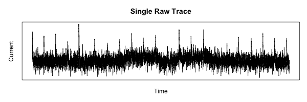
It took me a while to figure out how to set up the margins on the plot, but it turns out to be simple once you find the proper command to set the graphics defaults.
mar(bottom, left, top, right) sets the margins around the plot, and mgp(title, x, y) sets the margin lines for the title and axes.
1 2 | |
Plotting to a PNG image is also possible, with the result following:
1 2 3 4 | |
Simplifying the Data
Now that we have the basics laid out, onward to some real work.
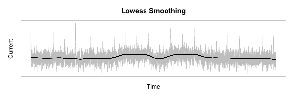
The first step needed to process the measurements is to smooth out the data to allow the lower-frequency features to be more visible.
To do this, I am going to use R’s lowess function.
The best way to describe what this does is with an example:
1 2 3 4 5 6 7 | |
Alignment
The next step is pure magic.
What we need to do is align each measurement trace collected so that corresponding features can be compared and analyzed.
The plan is to use R’s ccf function, which plots the correlation between two functions vs. the lag between them.
1 2 3 4 5 6 7 8 9 | |
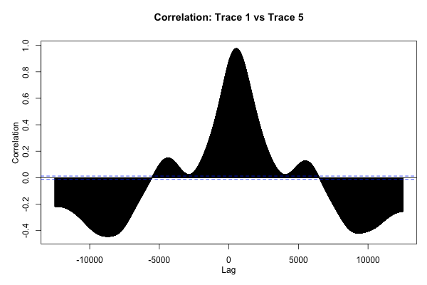
This plot is neat to look at, but what we really want is to find the absolute maximum of this function, which represents the offset that will cause the two traces to be aligned as well as possible.
1 2 | |
The preceding code returns 536 for the data shown here, which passes the “sniff-test” according to the plot of the ccf function shown in the previous section.
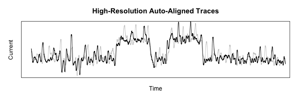
If we lag the second plot using this amount, they should line up:
1 2 3 4 5 6 7 8 9 | |
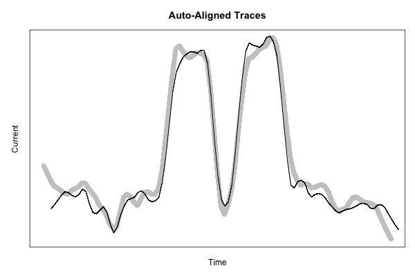
This code starts to get pretty ugly, but the resulting figure shows just how nicely-aligned these features are, using a more fine-grained smoothing function to show a bit more detail:
1 2 3 4 5 6 7 8 9 10 11 | |
That’s all for now! Coming up next time: cropping out just the interesting part of all the traces to build up a useful data set.